The monthly CPI report is the most consequential single data release in the United States economic calendar. Professional analysts do not spend time on the headline number. They ask a narrower, harder question: is inflation cooling structurally, or only optically? The answer determines rate expectations, portfolio positioning, and the real return on every cash reserve held by savers who trust nominal yield figures without doing the subtraction.
CPI at a Glance: Key Facts
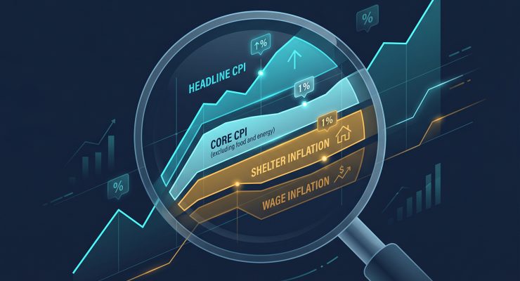
Why CPI Reports Matter More Than Most Headlines Suggest
Three figures matter on the morning of a CPI release: the month-over-month change, the three-month annualised rate, and the six-month annualised rate. The year-over-year headline figure that drives news coverage carries eleven months of stale data and is the least reliable indicator of current momentum. A three-month annualised rate falling cleanly toward 2 percent in consecutive reports signals genuine deceleration. A favourable year-over-year print built on a weak comparison period from the prior year signals nothing of the kind.
Savers face a specific, underappreciated version of this problem. Nominal interest rates on savings accounts are straightforward to compare across institutions. Real interest rates require one calculation: subtract the current CPI rate from the yield on a savings account or Treasury bill. That single step reveals whether cash reserves are preserving purchasing power or losing it quietly. The choice of which CPI figure to use in that calculation, headline versus core versus the three-month annualised rate, is not an academic distinction. It is a financially consequential one.
Analysts also isolate structural sub-components before forming any view. Services excluding shelter, known in Federal Reserve circles as supercore, reflects domestic wage and demand pressures more directly than any other series in the report. A falling headline print combined with a sticky or rising supercore reading is not a clean disinflation signal. It is a report where the visible improvement is supply-driven and temporary, and where the internal pricing dynamics that determine central bank policy remain unresolved.
Why CPI Release Days Move Stocks, Bonds, and Currencies
At 8:30 AM Eastern time, the Bureau of Labor Statistics publishes the report. Within five seconds, automated trading algorithms have processed the deviation between the actual print and the consensus forecast and issued buy or sell orders across equity futures, the two-year Treasury, and major currency pairs. The speed of the market’s initial response has nothing to do with fundamental analysis. It is a mechanical function of how the actual number compares with the expected number, regardless of what either means in isolation.
The deeper mechanism is Federal Reserve rate path calibration. CPI data either validates or disrupts the interest rate trajectory that bond markets have already priced in. A softer-than-expected core reading shifts rate-cut probabilities forward and pushes Treasury yields lower immediately. A hotter-than-expected print does the reverse, compressing valuations on rate-sensitive equities and extending the implied path of restrictive monetary policy. As our analysis of how markets regularly attribute complex daily moves to a single catalyst when the actual drivers are more numerous illustrates, the story told in financial media on CPI days rarely captures the full set of forces at work.
Corporate profit expectations add a third layer. A higher-than-expected CPI print implies that input cost pressures have not eased as much as hoped, which compresses operating margins unless the company holds sufficient pricing power to pass those costs to consumers. Not all companies do. The equity market’s sector-level responses to CPI prints, with consumer staples and utilities behaving differently from technology and discretionary growth, reflect exactly that distinction playing out in real time.
The Difference Between Market Reaction and Economic Reality
Markets respond to whether the report beats or misses expectations. The economy responds to what the report actually means. These are different things operating on different timescales. A single soft category in an otherwise elevated report can drive a sharp morning equity rally based on pattern-matching algorithms and momentum traders. By afternoon, when analysts have read the underlying component breakdown, those gains may be fully reversed as stickier parts of the data become the dominant narrative.
The structural impact of inflation on households and supply chains operates on a six to twelve month lag relative to the official data, which itself lags real market conditions. An OER reading that appears elevated in this month’s report is likely reflecting rental contracts signed six months prior. Asset prices adjust instantly. Economic reality adjusts slowly. Treating the former as a reliable guide to the latter is a consistent source of positioning errors among investors who act on release-day momentum without examining the component breakdown.
CPI Data Explained: What the Consumer Price Index Actually Measures
The Bureau of Labor Statistics constructs the CPI by tracking approximately 80,000 goods and services representing the spending patterns of urban households across the United States. The basket is not a simple average. It uses geometric weighting formulas that implicitly account for consumer substitution: if beef prices surge and consumers shift toward chicken, the calculation treats that substitution as a real behavioural response rather than ignoring it. That design choice is intentional, and it is one reason critics argue the index understates the cost burden on lower-income households with less flexibility to substitute.
The published data is also seasonally adjusted. Raw price data contains predictable calendar-driven noise, from summer gasoline demand to holiday retail discounts. Seasonal adjustment strips those patterns out to reveal the underlying signal. The unadjusted figures are published alongside the adjusted data for transparency, but the seasonally adjusted series is what analysts and policymakers use as the operative number. The table below shows the major components of the CPI basket and their approximate weightings.
| Category | Approx. Weight | In Core CPI | Volatility Profile |
|---|---|---|---|
| Shelter (rent + OER) | ~35% | Yes | Low to moderate (lagged) |
| Food at home | ~8.5% | No | High (seasonal and weather-driven) |
| Food away from home | ~5% | No | Moderate (wage-sensitive) |
| Energy | ~7% | No | Very high (geopolitical) |
| Medical care services | ~6.5% | Yes | Moderate (sticky) |
| Transportation services | ~6% | Yes | High (fuel-linked) |
| Apparel | ~2.5% | Yes | Moderate |
| Education and communication | ~6% | Yes | Low (sticky) |
| Recreation | ~5% | Yes | Low to moderate |
Headline CPI vs Core CPI: Which Inflation Measure Matters Most?
Headline CPI captures the full cost of living, including food and energy. It is politically and socially relevant because it is used to calculate Cost-of-Living Adjustments for Social Security benefits and to index federal tax brackets. When consumers describe inflation as painful, they are describing headline inflation at the grocery checkout and the fuel pump. The Federal Reserve does not use it as its primary policy target.
Core CPI removes food and energy from the calculation, not because those categories are unimportant to households, but because their short-term price behaviour is driven largely by global supply factors that monetary policy cannot address. Tightening in response to energy-driven headline spikes has historically produced policy errors. By focusing on core, policymakers can assess whether domestic demand pressures are actually building or receding, rather than reacting to a commodity shock that will resolve independently of interest rates.
Neither measure is always the right one. An energy-driven collapse in headline CPI can make inflation appear cured while underlying service costs are still rising. A weather-induced spike in food prices can push the headline figure to alarming levels while the domestic economy is actively cooling. The table below compares the properties of both measures and the conditions under which each is most reliable.
| Property | Headline CPI | Core CPI |
|---|---|---|
| Includes food and energy | Yes | No |
| Used for Social Security COLA | Yes | No |
| Fed policy reference | Secondary | Primary (alongside Core PCE) |
| Useful for assessing consumer pain | Yes | Partial |
| Risk of misleading signal | High (energy and weather distortions) | Lower; shelter lag remains |
| Best indicator of structural trend | No | Yes (with shelter adjustment) |
The Shelter Component: The Most Misunderstood Part of CPI
Shelter accounts for roughly 34 to 36 percent of the headline CPI basket and over 40 percent of the core basket once food and energy are removed. It is the single largest component in either series, and its behaviour largely determines whether the total index rises or falls in any given month. This weight is not an accounting quirk. Housing is the largest monthly expense for the majority of American households, and the 34 percent allocation reflects that economic reality.
The component breaks into two primary sub-series. Rent of primary residence tracks what tenants actually pay. Owner’s Equivalent Rent, which accounts for roughly 26 to 28 percent of the total CPI basket on its own, is not an out-of-pocket expense. It is a statistical estimate derived from asking homeowners what they believe their property would rent for on the open market. The rationale is sound: it separates the consumption value of housing from the asset price of real estate. The practical consequence is that the single largest sub-component of the CPI measures a price that no one actually pays.
The data carries a structural lag of six to twelve months relative to real-world conditions. The BLS surveys rental units on a rotating basis, updating each unit roughly once every six months. New lease signings tracked by private real estate platforms reflect current market rates. The official CPI captures the average across all existing leases, most of which were set months ago. The result is that the shelter component can continue rising in official reports for months after actual market rents have peaked and begun to decline. Analysts who understand this lag apply a forward discount when assessing where the core index is actually headed.
CPI Headline Basket: Approximate Component Weights
~35%
~13%
~7%
~7%
~38%
Wage Inflation: The Missing Piece in Most Inflation Discussions
The CPI measures what consumers pay. It does not measure what they earn. Wage growth sits outside the report entirely, yet it is one of the most important inputs for forecasting where services inflation goes next. Higher wages increase aggregate demand by giving consumers more disposable income to bid up prices of limited goods and services. They also raise the primary input cost for service-sector businesses, which respond by lifting prices to maintain margins. The channel from rising wages to rising service prices is well established and tends to operate with a two to three quarter lag.
The most dangerous version of this dynamic is the wage-price spiral: wages rise to compensate for past inflation, businesses raise prices to cover higher labour costs, workers demand further increases in response, and the cycle repeats. The spiral is most self-sustaining in low-margin service sectors where labour costs represent 60 to 80 percent of total operating expenses and pass-through to consumer prices is near-automatic. Central banks monitor wage growth as a leading indicator of services inflation precisely because of this mechanism.
Three labour market indicators provide the clearest early warnings. Average Hourly Earnings, released monthly alongside the nonfarm payrolls report, gives the quickest snapshot of wage momentum. The Employment Cost Index, published quarterly, adjusts for shifts in the composition of employment between sectors and includes benefit costs, making it the more accurate measure for policy purposes. The quit rate from the Job Openings and Labor Turnover Survey tracks the share of workers voluntarily leaving their positions. A persistently high quit rate signals that workers are confident enough to move for better-paying roles, which is a reliable leading indicator of wage acceleration before it appears in monthly earnings data.
Why Consumers Often Feel Inflation Is Worse Than CPI Suggests
The CPI measures a national average. No single household lives the national average. Lower-income families allocate a substantially larger share of income to food, utilities, and transportation, the categories that experienced the sharpest price increases during the recent inflationary period. The official index weights these categories according to average urban household spending, which includes a meaningful allocation to discretionary goods and services that lower-income households rarely purchase. The result is a number that systematically understates the inflation burden on the households most exposed to it.
A separate distortion arises from conflating the rate of price change with the level. When CPI drops from 8 percent to 3 percent, prices are not falling. They are rising more slowly on top of a base that already rose 8 percent the year before. Consumers feel the compounding effect of that accumulation. The official data measures only the current year’s increment. The gap between those two frames of reference is the persistent source of public frustration with official statistics even as reported figures show improvement.
Shrinkflation compounds this gap further. Manufacturers hold nominal prices steady while reducing package sizes or substituting cheaper ingredients. The CPI methodology attempts to adjust for quality degradation, but the adjustments are imperfect and applied with a lag. A consumer who notices that a coffee tin contains 350 grams instead of 400 grams at the same price has experienced a 14 percent effective price increase that may not fully register in the official series.
Disinflation vs Deflation: Understanding the Difference
Disinflation means the rate of price increases is slowing. A CPI reading that drops from 5 percent to 2.5 percent is disinflationary: prices are still rising, just less aggressively. Deflation means the overall price level is falling. A negative CPI reading means the average basket of goods costs less than it did twelve months ago. Financial media regularly conflates these two states, and that confusion shapes public expectations in ways that have real economic consequences. Consumers who expect prices to return to 2019 levels because inflation is “falling” are misreading the data. They will remain dissatisfied by grocery bills that simply stop rising rather than reversing.
For investors, the distinction matters differently. Disinflation typically supports long-duration bonds and growth equities by creating a stable rate environment, giving businesses and households the predictability required for multi-year financial planning. Deflation, by contrast, is economically damaging: it encourages deferred purchases, compresses corporate revenues on a nominal basis, and raises the real value of existing debt burdens, which can produce a feedback loop of contraction that is substantially harder for central banks to reverse than inflation.
Looking Beyond CPI: Other Inflation Indicators Worth Tracking
The Federal Reserve’s preferred inflation gauge is the Personal Consumption Expenditures price index, published by the Bureau of Economic Analysis. PCE uses a dynamic basket that updates monthly to reflect substitution behaviour, rather than the fixed basket revised annually in CPI. It also captures a broader set of expenditures, including healthcare costs paid by employers on behalf of consumers. The Fed’s 2 percent target is stated in terms of Core PCE. CPI typically runs 30 to 50 basis points above Core PCE due to methodological differences, principally in how shelter is weighted. Analysts who track only CPI without translating it into the Fed’s preferred framework will systematically misestimate where policy stands relative to target.
The Producer Price Index measures prices at the wholesale level, tracking what producers receive for their output. PPI is a leading indicator for CPI because cost increases at the production stage tend to filter through to consumer prices over a two to six month horizon. A sustained PPI surge preceding a flat CPI reading typically signals margin compression in the corporate sector, with companies absorbing input costs rather than passing them forward. That situation is either temporary, until pricing power is exercised, or permanent, reflecting a demand-constrained environment where consumers cannot absorb further price increases.
Inflation expectations surveys, particularly the University of Michigan consumer sentiment survey and the Federal Reserve Bank of New York’s consumer expectations survey, round out the picture. If five-year inflation expectations drift persistently above 3 percent, it signals that the public is beginning to doubt the central bank’s ability to restore price stability. Anchored long-run expectations are a prerequisite for effective monetary policy. Surveys showing deanchoring provide earlier warning than any statistical data series, because expectations themselves become inputs into the wage and pricing decisions that produce the next round of inflation data.
How to Read a Monthly CPI Report Like an Analyst
Start with the month-over-month change, not the year-over-year figure. The annualised three-month rate tells you what the current trajectory implies for the full year if it continues. Comparing that implied annual rate to the 2 percent target immediately contextualises whether the current pace is consistent with easing, steady policy, or further tightening. If the six-month annualised rate is converging with the three-month rate, the trend is stable. If they are diverging, a turning point is in development.
Next, identify the largest contributors by weighted contribution, not by percentage change. A 40 percent spike in airline fares moves the headline figure less than a 0.3 percent increase in OER, because airline fares carry a basket weight below 1 percent while OER carries a weight above 25 percent. Contribution analysis strips out the misleading optics of large percentage moves in small categories and focuses attention where actual inflationary pressure is concentrated. Analysts also assess breadth: a report where 70 percent of categories are rising simultaneously is more structurally concerning than one where three categories account for all the index movement.
Finally, calculate supercore. Take Core CPI, subtract shelter, and assess the residual. That series isolates service price pressures driven purely by domestic wages and demand, independent of the housing market’s structural data lag. A supercore rate that has decelerated toward 2 to 3 percent on a three-month basis is the clearest signal available within a CPI report that underlying domestic inflation is genuinely cooling, rather than merely reflecting base effects or temporary commodity normalisation.
CPI Release Day: From Data Drop to Market Positioning
Is Inflation Really Improving? A Framework for Finding the Answer
Genuine cooling requires three things to occur simultaneously: a broad-based month-over-month deceleration across independent categories, a sustained decline in supercore and services metrics, and evidence from PPI and supply chain data that wholesale input costs are normalising. All three together constitute a structural disinflation signal. Any one in isolation, particularly a favourable headline driven by energy price relief or a weak comparison period from the prior year, does not meet that standard.
Warning signs of reacceleration include sharp reversals in core goods prices, which often reflect tariff implementation or renewed supply chain disruption; shelter components that fail to decline despite a cooling housing market, locking in a persistently high floor under core; and commodity price spikes that threaten to flow through into core categories over a two to six month horizon. After every CPI release, three questions are worth asking: Is the rolling three-month rate moving toward or away from 2 percent? Are price increases expanding across categories or confined to a few isolated sectors? And does this specific print shift the Federal Reserve’s stated rate path in a direction that affects the real yield on cash reserves and fixed-income positions?
Key Takeaways: Separating Noise from Signal in Inflation Reports
The headline CPI number tells you the least useful thing about inflation. The three-month annualised rate of core services excluding shelter tells you the most. Between those two data points sits the entire analytical gap between what financial media reports and what professional economists and traders actually act on.
Shelter’s data lag means official reports reflect housing market conditions from six to twelve months prior. Analysts apply a forward discount when they have access to contemporaneous private-sector rental data showing a different trajectory. The monthly CPI report is the most visible piece of a mosaic. Treating it as the whole image is the most common analytical error made by the investors and savers who move markets hardest on the days it is released.
Four Questions to Ask After Every CPI Report
The Fed’s policy decisions are calibrated to Core PCE, not CPI. Analysing inflation data in isolation, without cross-referencing wage growth, PPI, and inflation expectations surveys, produces an incomplete picture. Consistent, broad-based disinflation across all three frameworks simultaneously is what a genuine turn in the inflation cycle looks like. A single favourable headline print is not. ■